
Certiflink: the before and after of the message
Certiflink came to Conversion Lab with a product that worked and a website that only listed features. The challenge: find out who the platform really sells to, and turn hidden differentiators into a message that explains why anyone pays.

“It came across as much more professional. Since the new site went live, we’ve been getting far more qualified leads, an audience much closer to our ICP.”
Before
- The headline described the task (“send certificates by email”), not the outcome for the buyer.
- Features listed one after another, without saying who the tool is for or what problem it solves.
- Generic images and context-free social proof that did nothing to support the decision.
- Shallow engagement: over 80% of visits on mobile, and almost no one scrolled past mid-page.
After
- An outcome headline: the completion certificate as an engine of business growth.
- Home organized by use case: training, events and conferences, digital launches.
- The client’s challenges side by side with what Certiflink solves.
- Micro case studies with audience, challenge, solution and result, next to the person who said it.
Before/ Home

After/ Home

Before/ Features
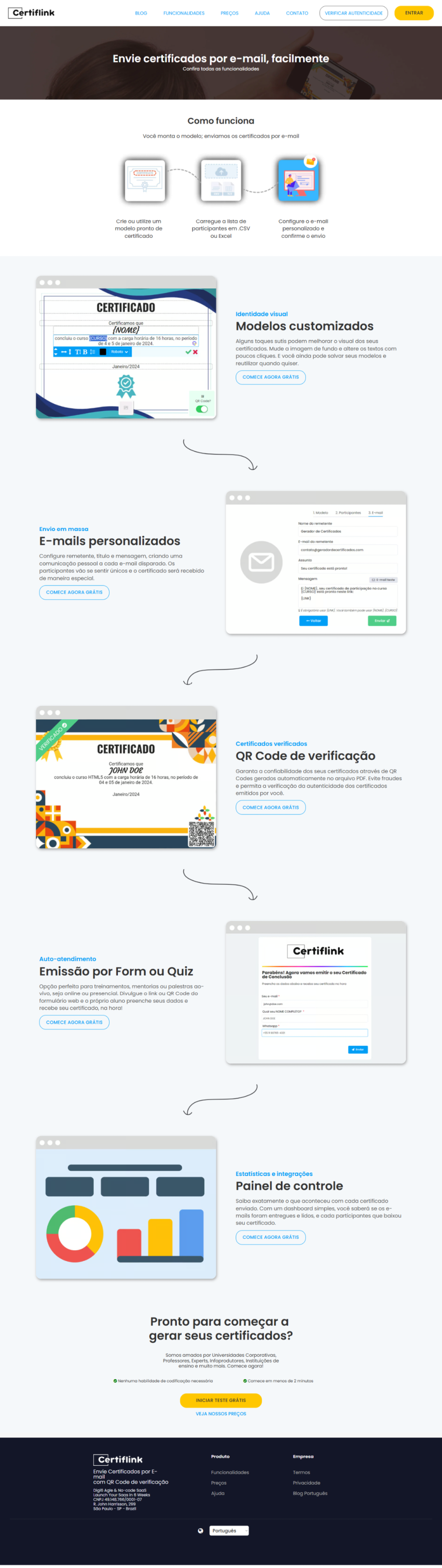
After/ Features

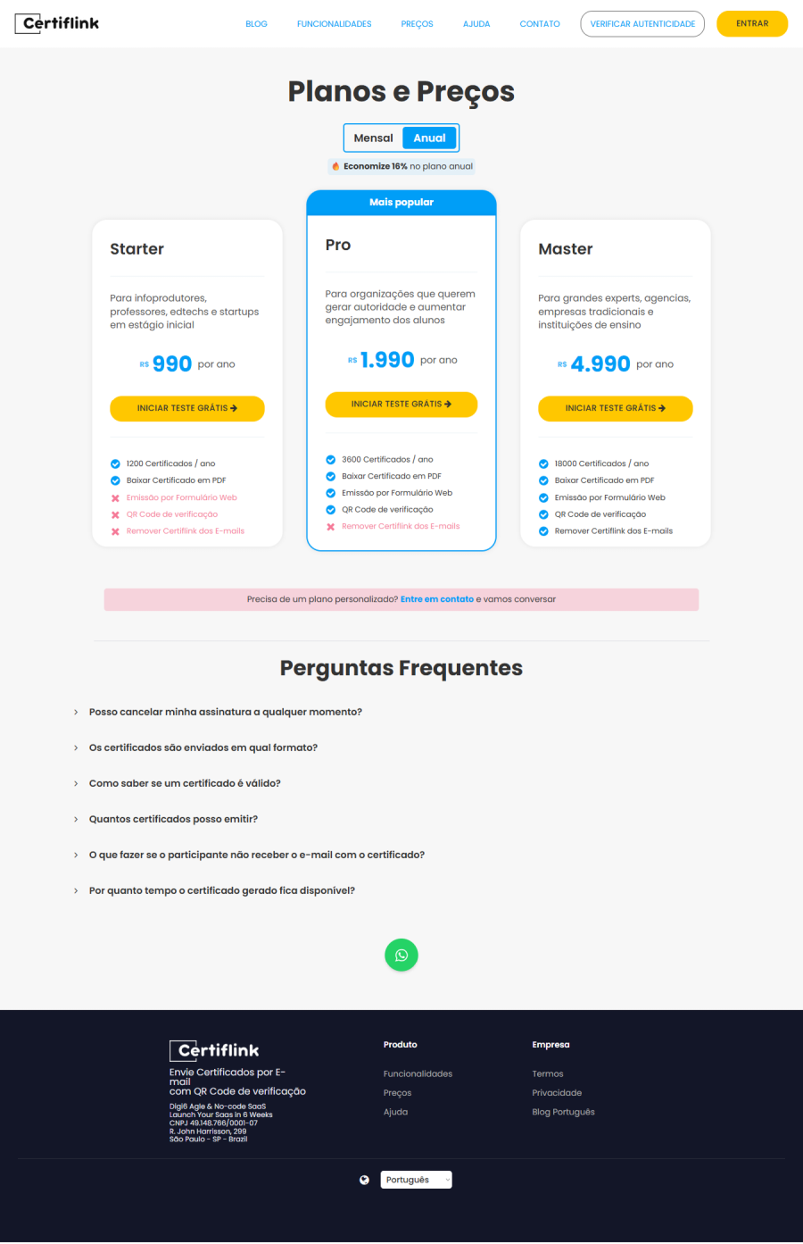
Before
- Plans set apart only by volume, with a bare list of features.
- No plan said who it was for.
- What each plan lacked, marked in red, drew more attention than what it delivered.
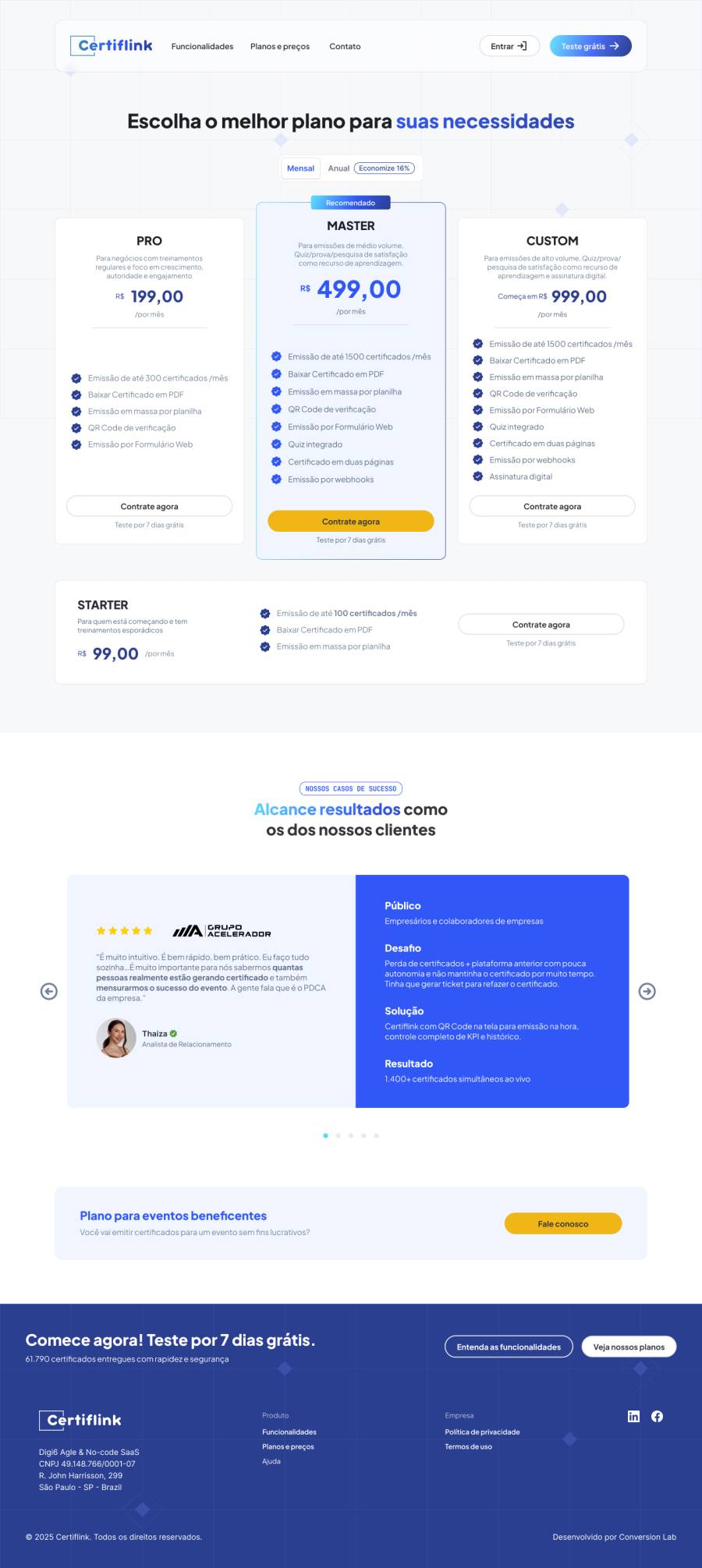
After
- A visible ladder — Pro · Master · Custom — with Master recommended in the center.
- Each plan with a line saying who it is for, not just what it includes.
- Starter kept as an entry point, away from the center of the page.
- A micro case study and a plan for charity events right below the table.
Before/ Plans & pricing
After/ Plans & pricing
Your next step
The next before/after could be yours.
45 minutes for you to tell us where the message is stuck and leave with more clarity than you came in with.
Book a meeting ›